The Graphs You Never See! |
Unlike FedEx's charts and figures, mine are verifiable as being totally factual. Understand that it is not my intention to cast aspersions on management's integrity (If you believe that, have I got some swamp land to sell you!). It is simply the justifiable cynicism through which I view any information provided to FedEx employees by our corporate leadership. If you visit my web site with any regularity, you know that I provided incontrovertible evidence that Fred told outright lies to his own managers in his "From The CEO" publication dated March 3, 1997! So, if Fred is willing to dish out bovine excrement to his own management staff, you'll forgive me if I don't trust any facts and figures management lays out for us... You can check all of my figures by simply visiting the Securities and Exchange Commission's web site and bringing up the past three years of FedEx proxies filed with the Commission. Look for the forms called "DEF-14A" in their Edgar database after using the search term "FEDERAL EXPRESS."
 |
|---|
 |
 |
|---|
|
|
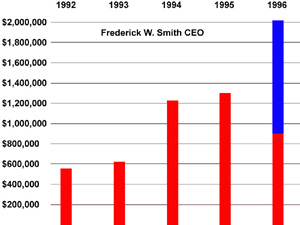
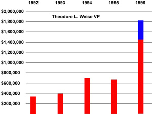
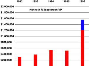
| NAME | YEAR | SALARY | BONUS | OTHER ANNUAL COMP. | ALL OTHER COMP. | TOTAL |
|---|---|---|---|---|---|---|
| Smith, Frederick W. | 1996 | 745,833 | none | 131,742 | 24,174 | 901,749 |
| 1995 | 700,000 | 515,500 | 96,541 | 22,232 | 1,334,273 | |
| 1994 | 650,121 | 470,000 | 84,016 | 5,573 | 1,209,710 | |
| 1993 | 550,368 | none | 66,404 | 2,154 | 618,926 | |
| 1992 | 550,368 | none | none | none | 550,368 | |
| Weise, Theodore L. | 1996 | 449,604 | 37,500 | 974,734 | 12,947 | 1,474,785 |
| 1995 | 417,994 | 188,480 | 58,016 | 12,021 | 676,511 | |
| 1994 | 399,360 | 214,675 | 105,720 | 4,440 | 724,195 | |
| 1993 | 364,585 | 33,261 | none | 2,154 | 400,000 | |
| 1992 | 328,901 | 30,438 | none | none | 359,339 | |
| Masterson, Kenneth R. | 1996 | 396,688 | 37,500 | 764,729 | 10,743 | 1,209,660 |
| 1995 | 378,478 | 138,880 | none | 10,617 | 527,975 | |
| 1994 | 357,162 | 180,428 | none | 4,175 | 541,765 | |
| 1993 | 345,198 | 45,111 | none | 2,154 | 392,463 | |
| 1992 | 295,202 | 13,898 | none | none | 309,100 |
Now that you've had a chance to digest the above charts and figures, you are probably experiencing several different emotions. When I finished putting the data and graphs together, the first feeling I felt was vindication. In my last article on the web site, "Responding To The CEO," I mentioned that the "tough decisions" Fred said "we" had made over the past 10 years only affected "our our pocket books, our job security, our benefits and our dignity!" As these graphs and figures clearly illustrate, I was absolutely right. Fred and the boyz have not "felt our pain" any more than any slick Washington political hack has when raising our taxes!
While I felt vindicated, the emotions you are probably experiencing now are likely to be quite different. Those of you who have idolized Fred like some sort of rock star might be feeling just a little betrayed by the fact that while he was tossing a few of us an anti-union bone of a 3% raise, he and the boyz were almost doubling their salaries and compensation last year alone! Those of you who are closer to my level of cynicism probably feel angry at finally seeing your suspicions confirmed by hard numbers and graphical representations, but you aren't really shocked because we knew all along that while Fred and the boyz got the elevator we were all just getting the shaft. However, the 1996 figures managed to sting even my encrusted sensibilities!
Understand that I'm not trying to pander to class envy here. I expect executives of corporations to make much more than I do. Where I have a problem is when those executives' compensation gains are disproportionate to the gains being made by those beneath them in the corporate structure. In other words, if those under Fred and the boyz are getting no raises, then a true "People" oriented management would also freeze their own wages! If we have to get by on $30k - $40k year after year after year, then I don't think it is at all unreasonable to expect Fred and the boyz to eke out a living at constant levels of $400k - $600k!
I wish I could tell you that you've heard all the bad news at this point, but as some you have already guessed, the preceding graphs and figures reveal a far harsher truth! For if we assume that the charts of financial doom senior managers are now presenting to FedEx workers are indeed accurate, then we are presented with a portrait of reckless and greedy management at Fedex's helm which has helped itself to bigger and bigger pieces of of a shrinking pie culminating with what practically amounts to corporate rape in 1996! Think about this for a moment! If the charts are accurate and are telling the whole story, and we are indeed teetering on the brink of going into the red ink as a company (which is precisely what the charts intimate), could the plundering that Fred and the boyz engaged in in 1996 be a signal that they are grabbing the money while they can in preparation for FedEx going down the tubes? If the information we got at our presentation was worth the code 38 time it took up, this speculation of mine seems entirely plausible, doesn't it?
Before you start running out to grab a copy of today's newspaper to frantically search the "help wanted" section, let me just say that I don't think the presentation was worth the code 38 time it took up! Not only was the financial data of our international service revenues conspicuously missing from the presentation, but if one simply logs on to FedEx's own web site and reviews the financial data the company presents to the general public, one is quick to get the impression of an extremely profitable company with a bright future! To save you that trip, I have provided my own versions of the graphs you'll find there below. I had to make my own versions to keep FedEx's legal eagles from again descending down upon my site and whining about its cosmetics....
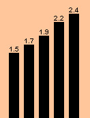
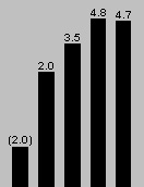
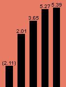
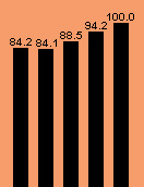
| 1992-1996 Summary | |||||
| Revenues (in billions of dollars) |
| Average daily express packages (in millions) |
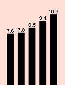
| Return on assets(1) (percent) |
| Earnings per share(1) (in dollars) |
| Average number of employees (in thousands) Based on a standard full-time workweek |
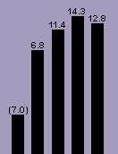
| Return on equity(1) (percent) |
(1) In 1992, changes in an accounting principles and restructuring charges related to FedEx's European operations affected Return On Assets and Return On Earnings figures. For further information on the specifics of these changes and charges, visit the "Financial Highlights" page on FedEx's web site. |
|||||
Now it's time for a pop quiz boys and girls! After looking at the graphs for Fred and the boyz and the graphs FedEx presents to the public, what ironic coincidence do these two sets of graphs show? [Hint #1] Look carefully at the year 1996. [Hint #2] Center your scrutiny on the Return On Assets and Return On Earnings graphs. See it yet? That's right! At a time when both the company's return on assets and return on earnings were experiencing a dip on the charts, Fred and the boyz were helping themselves to a double-dip out of the company's coffers! Obviously they weren't as bothered by a downward sloping graph as they expect us to be....
This isn't the end of the presentation of charts on this site. I have plans for graphs featuring our wages as indexed to the consumer price index to demonstrate just how much we've all lost over the past 10 years and others I will create as I accumulate data pertinent to our jobs. As always, your input is both solicited and welcome!